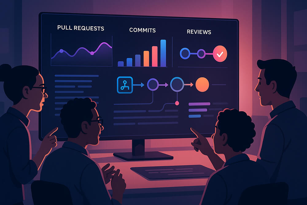
A Git dashboard is the first stop when you need an unfiltered snapshot of your codebase. Instead of clicking through branches, commits, and pull requests one at a time, the dashboard aggregates key signals and instantly shows what is moving forward, what is stalled, and where your attention is most valuable.
A GitHub-based dashboard goes far beyond tallying commits. It provides context on who is reviewing, which pull requests are awaiting feedback, how long each task spends in each stage, and whether releases are landing on schedule. By converting raw Git history into actionable insights, the dashboard transforms stand-ups, sprint planning, and post-incident reviews into data-driven conversations, eliminating guesswork.
Why Teams Use Dashboards
Tools that merely archive history tell you what has already changed. Dashboards show what’s changing right now and why it matters. When you wire one into your workflow, you unlock:
- Instant alignment: Engineers, leads, and PMs share the same live snapshot of “in progress,” “awaiting review,” and “ready to ship.”
- Early bottleneck detection: When reviews clog on a repo every Tuesday afternoon, you’ll spot the slowdown long before it jeopardizes a release.
- Evidence-based planning: Sprint sizing and delivery forecasts lean on hard lead-time data, not gut feel.
- Zero-effort reporting: The insights already exist in Git; the dashboard surfaces them, allowing developers to focus on writing code instead of creating status updates.
The Metrics That Actually Help
Many statistics show up in GitHub, but only a handful truly improve delivery flow. Focus on the following metrics first:
- Cycle Time (with stages): The time it takes from the first commit to production. It breaks the path down into time to first review, time in review, and time from approval to deployment. It also shows where the bottleneck is: in coding, reviewing, or releasing.
- Pull Request Size: the median lines of code per PR. Smaller PRs get reviewed faster, cut merge conflicts, and localize failures.
- Review Turnaround: the time elapsed between the PR open and the first reviewer comment. Spikes indicate overloaded reviewers or unclear ownership.
- Work in Progress (WIP): the number of open branches or active PRs per developer. High WIP correlates with context switching and longer lead times. Enforce WIP limits to maintain a steady workflow.
- Merge/Deploy Frequency: the number of deploys per day/week alongside the percent of rollbacks or hotfixes. Pairing speed with stability prevents high throughput from masking quality regressions.
- Contributor Trends: the rolling 4-week commit or PR volume by person, team, or repo. Continuous dips can indicate onboarding or capacity issues, while spikes indicate ownership risks.
Choosing a Tool: Build vs Buy
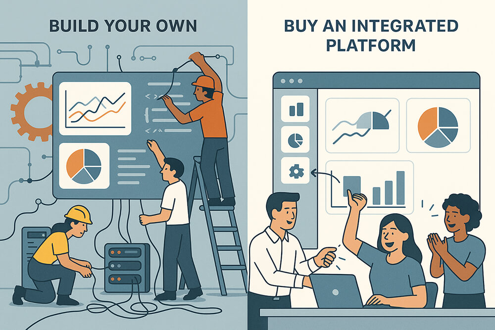
You have two clear routes to a Git dashboard: compile your own stack or plug in a turnkey platform. Select the option that best matches your requirements.
1. Build Your Own
- Why: You need custom KPIs, strict on-prem security, or role-specific views that vendors don’t offer.
- Cost: Continuous engineering time for ETL jobs, storage, and schema upkeep.
- What to watch: Data freshness, mapping Git to SSO identities, and stable definitions of metrics. Different vendors may use different terms for “lead time,” so make sure that everyone in your company agrees on its definition and uses it consistently across all tools and times.
2. Buy an Integrated Platform
- Why: You want value on day one: curated metrics, polished visuals, and plug-and-play CI/CD and issue-tracker hooks.
- Cost: Subscription fees and some willingness to adapt to the vendor’s model.
- What to watch: Granular role-based access, long-term retention limits, support for custom fields, and alert thresholds you can tune to your process.
Best Practices to Follow
- Clarify the job. Decide whether you’re trying to achieve faster reviews, more stable releases, sharper planning, or a mix. Naming the top two ensures that every metric, alert, and conversation is aligned with impact.
- Start with 3-5 metrics. A focused GitHub dashboard is easier to adopt. Use Cycle Time (staged), Review Turnaround, PR Size, and Merge Frequency as your core.
- Wire the data, then validate it. Connect repos and CI. Compare a week’s worth of dashboard numbers to reality during the stand-up and fix mismatches early.
- Make it visible. Put the dashboard on a team TV, a Confluence page, or the sprint board. If it’s hidden, it won’t change behavior.
- Set soft thresholds. For example: cap PR size at a range that fits your codebase (often 200-400 lines), flag reviews that sit idle beyond your team’s norm (e.g., 24 hours), or highlight branches older than 10 days.
- Review monthly. Keep what drives decisions; remove metrics nobody uses. Add a new metric only when a question continues to recur.
Bottom Line
A good dashboard is a conversation starter, not a scoreboard. It shows the team one clear board with the numbers that count: how long changes take, how big the pull requests are, and how often code ships successfully, measured by deployment frequency alongside change failure rate (e.g., the percentage of rollbacks or hotfixes). Whether you code the tool yourself or subscribe to one, the goal should be to turn raw Git activity into clear signals that let everyone spend more time shipping and less time guessing.