Teams often miss release dates because they guess capacity. A velocity chart can change this by converting raw historical data into facts. With the chart, software engineers and project managers see trends, spot blockers early, and plan work with fewer surprises.
What Is a Velocity Chart?
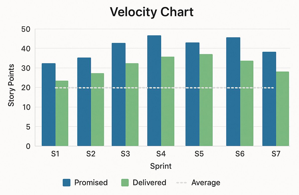
A velocity chart plots sprint velocity: the number of story points finished in each sprint, against the points the team initially promised. The X-axis lists sprints; the Y-axis shows total points. Two bars (promised vs. delivered) and a light average line make the data easy to scan. By reading this chart, teams on any software development platform can forecast future work more accurately, rather than relying on guesswork.
Understanding Velocity in Agile Methodology
- Agile Velocity: total story points that meet “Definition of Done” in one sprint.
- How to measure: At sprint close, sum points on finished stories.
- How to track: Let your issue tracker record the points and then export them to a dashboard or script.
Use sprint velocity only to judge the whole team, never a single person. Many everyday tasks can push velocity up or down:
- Tech-debt cleanup: refactoring old code or improving tests.
- On-call pages: urgent production alerts that interrupt sprint work.
- Rollbacks: undoing a bad release and fixing the fallout.
- Feature flags: turning new code on or off in stages, which adds overhead.
Because all of these tasks are shared, the number of story points finished tells you about team throughput, not individual output.
In platform engineering, the same team-level velocity indicates whether the reusable services you build (CI pipelines, internal APIs, and deployment tools) are evolving quickly enough to keep pace with the product teams that depend on them.
Components of a Velocity Chart
X-Axis – Sprints
- Maintaining the same sprint length each time ensures fair comparisons.
Y-Axis – Story Points
- Stick to one scale; don’t mix hours and points.
Promised vs. Delivered Bars
- Promised: points forecasted at sprint start.
- Delivered: points actually shipped.
- The gap shows scope creep or blockers.
Average Velocity Line
- The average of the last 3-5 sprints smooths spikes and informs forecasts for release planning or platform engineering tools.
A velocity chart can settle “platform engineer vs. software engineer” arguments.
If you label each story as platform work (infrastructure, CI scripts, deployment tooling) or feature work (user-facing code), the chart shows exactly how many story points the team spent on each in every sprint. Everyone can see when platform tasks reduce feature throughput, and decide together whether that trade-off is acceptable or needs adjustment.
Benefits of Using Velocity Charts
- Better forecasts: Divide the total backlog points by the average velocity to see roughly how many sprints you still need.
- Capacity clarity: A dip in velocity often means holidays, refactors, or production fires; a spike usually means you under-estimated work.
- Sharper retrospectives: Actual numbers trigger useful questions, such as “Why did velocity drop after the canary deploy?”
- Stakeholder trust: One clear graph is easier for non-tech leaders to grasp than a set of tickets.
- Platform fit check: For a platform in software development, the same data shows when APIs or other platform engineering tools are mature enough to move from beta to production.
Common Misinterpretations & Pitfalls
- Not a people KPI: Do not use velocity to rank individuals. Doing so kills teamwork. It must stay a team metric.
- Natural fluctuation: New tech, big incidents, or rollbacks swing velocity. Expect a range, not a perfectly flat line.
- No cross-team comparisons: Each team sizes story points differently. So comparing velocity across teams is meaningless.
- Changing point scales mid-stream: Switching from Fibonacci to T-shirt sizes wipes the history. If you must switch, re-baseline old data first.
Best Practices
- Wait for 3-5 sprints of data: Early numbers don’t give an accurate picture. Establish a baseline before you forecast.
- Pair data with talk: Bring the chart to every retro and add context, e.g., “Database migration slowed us.”
- Show the chart in planning: Let engineers, PMs, and platform stakeholders challenge estimates before the sprint starts.
- Slice work into small pieces: Break every user story or task into pieces worth 1-8 story points. On a Fibonacci scale that’s: 1, 2, 3, 5, 8.
- Automate the pull: Stop exporting sprint data by hand. Instead, let a small job run every night to query the tracker, group the data, and update the velocity graph sheets and dashboards.
Conclusion
Velocity charts turn sprint history into a clear guide for future work. They provide engineers, project managers, and platform engineering teams with an honest view of capacity, sharpen planning, and drive focused retrospectives, without blaming individuals.
Start simple: collect three clean sprints of story-point data, plot promised vs. delivered work, and review the average line in each planning session. Consistently using the velocity chart keeps both feature work and platform tasks on track for timely, high-quality releases.