Burndown charts are one of the easiest but most effective ways to visually track progress in Agile project management. A project burndown chart works with any Agile framework and shows real-time data on how much work remains, if the team is on track, and whether they can complete it.
What is a Burndown Chart?
A burndown chart is a diagram that displays the amount of work remaining in relation to the time. Usually, the X-axis shows time (days, sprints, or weeks), and the Y-axis displays the remaining work, which is commonly measured in story points, hours, or task count.
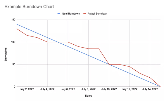
The chart usually has two lines:
- Ideal work line: A straight diagonal showing the ideal pace of work to reach zero by the deadline.
- Actual work line: A fluctuating line that tracks the team’s progress.
This simple visualization makes it easy to identify whether the team is ahead, behind, or on track.
Types of Burndown Charts
Different types of burndown charts are used depending on the project scope and reporting needs:
- Agile Burndown Chart: This general term refers to any burndown chart used within Agile practices. It can apply to sprints, releases, or overall project tracking.
- Scrum Burndown Chart: In Scrum, a burndown chart typically tracks work during a sprint (usually 2–4 weeks). It helps Scrum teams monitor their progress during daily standups and sprint reviews.
- Project Burndown Chart: A project burndown chart tracks work across the entire project lifecycle. It’s broader than sprint or release charts and helps stakeholders assess whether the overall project will be delivered on time.
- Release Burndown Chart: A release burndown chart tracks work for a specific product release. It determines if all features or stories planned for the release can be completed before the release date.
- Epic or Feature Burndown: These charts focus on tracking the progress of extensive features or epics across multiple sprints or teams.
How to Create a Burndown Chart
A burndown chart can be done manually or with tools like Jira, Trello, or Azure DevOps. Here’s a simple step-by-step guide:
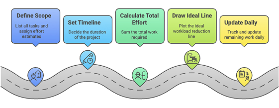
Step 1: Define the scope
List all tasks or user stories in your sprint, release, or project. Assign effort estimates (e.g., story points or hours).
Step 2: Set the timeline
Decide the duration (e.g., a 2-week sprint or a 3-month release).
Step 3: Calculate total effort
Sum the total work (e.g., 100 story points) that needs to be completed.
Step 4: Draw the ideal line
Plot a straight line from the top-left (start of the sprint with the full workload) to the bottom-right (end of the sprint with zero work).
Step 5: Update daily
Track and update the remaining work each day. Plot it on the chart to see if you align with the ideal line.
Can Burndown Charts Measure Developer Productivity?
A burndown chart tracks team progress, not individual performance. Also, many factors can impact a chart, such as changing requirements, blocked tasks, or under/overestimated stories. Using it to measure individual productivity can be misleading and demotivating.
Instead, use the chart to:
- Identify scope creep
- Spot process inefficiencies
- Improve sprint planning
- Encourage team collaboration
For individual metrics, tools like code commits, pull requests, or time tracking may offer better insight-although even these should be handled with care.
When Should You Use a Burndown Chart?
Burndown charts are especially useful in Agile environments that follow iterative and incremental delivery. Here’s when they shine:
- During sprint execution: Track if you’ll complete sprint backlog items within time.
- During release planning: Monitor if you’re on track to deliver all features by the release deadline.
- In daily standups: Share burndown insights to discuss progress and blockers.
- In sprint retrospectives: Analyze how well the team met goals and where improvement is needed.
- In stakeholder reports: Provide a clear visual of progress without technical jargon.
Final Thoughts
A burndown chart does more than just show progress-it helps teams communicate clearly. Whether you’re building a startup app or managing Agile in a large company, tools like Agile burndown charts, scrum burndown charts, and release burndown charts help teams stay flexible, aligned, and focused on their goals.