Enterprises no longer have to guess whether an AI coding assistant is being used. Copilot now has generally available usage metrics, dashboards, APIs, and export paths that show adoption, engagement, code generation, and pull request lifecycle trends. The harder question is not usage. It is whether that usage translates into measurable engineering value.
That is where most rollouts stall. Getting seats assigned is easy. Proving that the spend changed delivery speed, review effort, or engineering capacity is harder, especially when team structure, process changes, and release pressure are all moving at the same time. GitHub’s own documentation also makes clear that metrics coverage has boundaries: some data depends on IDE telemetry, seat management is tracked separately, and not every Copilot surface appears in the same reports.
This article is about measurement, not product features. The goal is to build a defensible ROI model that an engineering leader, finance partner, or platform team can actually use.
Where Copilot shows up in the workflow
In most teams, Copilot gets used in small moments rather than big headline moments. A developer asks for a test stub, rewrites a function, drafts documentation, or gets unstuck in a familiar codebase. That matters because ROI comes from the accumulated friction removed across hundreds of small tasks, not from one spectacular demo.
A practical way to think about the workflow is this:
- Code creation for scaffolding, repetitive logic, tests, and boilerplate
- Refactoring for cleanup, naming, and localized restructuring
- Documentation for comments, summaries, and developer notes
- Debugging support for explanation, remediation ideas, and faster investigation
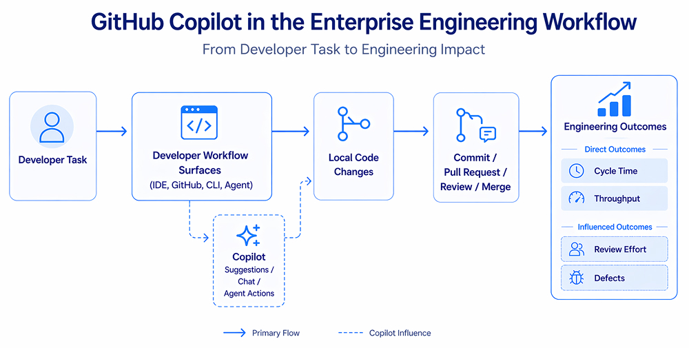
The point is not to list GitHub Copilot benefits in the abstract. It is to map where assistance shows up, and then decide which engineering signals should move if the tool is genuinely helping. GitHub’s current reporting model supports exactly that kind of layered view by exposing adoption, engagement, acceptance rate, lines of code, and pull request lifecycle data rather than just a seat count.
Why ROI is hard to measure
The first trap is visibility. A team can feel faster even if its delivery numbers don’t improve for a month. Another team can show more pull requests while quietly creating more review churn. High usage alone indicates that people are using the tool, but it doesn’t tell you whether the output is useful, durable, or cheaper than the work it replaces.
The second trap is attribution. Maybe delivery improved because the team also cleaned up CI, hired stronger engineers, or cut scope differently that quarter. GitHub’s own docs hint at this complexity by separating seat management from usage metrics and by noting that pull request data can appear even when IDE telemetry is missing. That is useful, but it also means careless comparisons can produce false confidence.
A third problem is that enterprise teams are uneven by design. Senior backend engineers, mobile teams, platform teams, and new joiners will not use Copilot in the same way. So a single ROI number for the whole company is usually too blunt at the start.
The core metrics that actually matter
Start with usage, but do not stop there. GitHub Copilot metrics now group data into adoption, engagement, acceptance rate, lines of code, and pull request lifecycle metrics. That is a good foundation because it lets you separate “people opened it” from “people trusted it” and from “delivery flow changed.”

Adoption should be the first gate. If only a minority of assigned users are active, there is no ROI story yet. GitHub explicitly positions DAU and weekly activity as the way to answer whether teams are using Copilot regularly, and growth after training can show whether enablement is working.
Acceptance rate is the next layer. It tells you whether developers accept suggestions often enough to suggest trust. But high acceptance should not be oversold. Sometimes a team accepts a lot of boilerplate and still sees no meaningful improvement in delivery. GitHub’s documentation is useful here because it pairs acceptance with lines added and PR lifecycle data, which helps you see whether accepted output connects to the actual flow.
This is where GitHub Copilot productivity metrics become more useful than anecdotes. Track time saved per recurring task category, median coding time for comparable tickets, PR throughput, and time to merge. If those metrics do not move, a high-usage dashboard may just be describing activity rather than value.
Measuring engineering impact, not just tool interaction
Most leadership teams eventually care about three downstream outcomes: delivery speed, engineering effort, and quality. Those should sit under the same measurement model.

GitHub’s own enterprise research with Accenture is useful here, not as a promise, but as a reference point. In that study, developers using Copilot saw an 8% increase in pull requests, a 15% boost in pull request merge rates, and an 84% increase in build success rate. Developers also reported less mental effort on repetitive tasks and less time spent searching for information or examples. Those are exactly the kinds of signals a serious ROI model should look for internally.
A compact internal scorecard often works better than one grand formula:
- Velocity: tasks completed, PR throughput, and lead time trend
- Quality: defect escape rate, review changes requested, and rework frequency
- Experience: onboarding speed, repeated search effort, and perceived cognitive load
One challenge here is turning scattered usage signals into something leadership can actually trust. Teams can also use Milestone for this, especially when they need a clearer view of GenAI adoption, engineering productivity, and ROI across different teams. That makes it easier to see whether Copilot is improving real delivery flow or just creating more tool activity.
How to isolate Copilot’s impact
This is the part many organizations skip, only to regret it later.
Do not roll out Copilot everywhere immediately and hope the dashboards explain the result. Use controlled rollout. Pick pilot teams, capture baseline data for at least one release cycle, and compare against similar teams that have not adopted it yet. GitHub’s daily reports and 28-day dashboard windows make this easier than before, but you still need a sound experimental shape.
A practical approach looks like this:

Keep the comparison honest. Match teams by language, service complexity, and release rhythm. Exclude quarters where a major reorg or platform migration distorts the signal. And do not compare only one sprint to another. AI tooling changes behavior unevenly, so one noisy week can tell the wrong story.
Converting engineering change into ROI
The formula does not need to be fancy. It needs to be credible.

Time savings value is the easiest part. Estimate hours saved on recurring work, multiply by loaded engineering cost, then discount aggressively so you do not overclaim. Avoiding rework cost comes from lower defect rates, fewer review cycles, or cleaner builds. Accelerated delivery value is harder, but for product teams shipping revenue-linked work, shortening idea-to-production time can be meaningful.
Where teams go wrong is on the cost side. License spend is obvious. The hidden costs are not.

GitHub’s audit log guidance is a good reminder that governance work is real. Audit logs cover settings changes, licenses, and agent activity on GitHub, but they do not include local prompt/session data, and default retention is 180 days. If your security or compliance teams need deeper, longer-lived evidence, you may need extra logging architecture and review processes. That cost belongs in the ROI model.
Common mistakes that ruin the measurement
The most common mistake is treating correlation as proof. A better quarter after rollout is not enough.
The second mistake is measuring only short-term speed. If output rises but review burden, security checks, or refactoring work rise later, the first number was incomplete. The third is using one global number for every team. Platform engineering, product squads, and legacy modernization work should be measured differently.
A final mistake is confusing trust with usage. GitHub’s own guidance suggests looking for patterns across DAU, acceptance rate, and PR flow rather than treating any one metric as decisive. That is the right instinct. Single numbers make nice slides. They rarely explain engineering reality.
Conclusion
A good Copilot ROI program is not built around enthusiasm or resistance. It is built around disciplined measurement.
Start with usage. Add acceptance and lines-of-code signals. Then connect them to delivery, review, and quality outcomes that matter to your business. If the tool is helping, the evidence will show up across several layers at once. If it is not, the same measurement model will tell you where adoption, trust, or workflow design is breaking down.
FAQs
1. What metrics prove GitHub Copilot delivers measurable ROI for engineering teams?
The best proof combines adoption, acceptance, and delivery metrics. Look for rising active usage, stable or improving suggestion acceptance, shorter median time to merge, better PR throughput, and lower rework or review churn. No single metric proves ROI on its own.
2. How do you separate GitHub Copilot’s productivity gains from developer skill improvements?
Use a controlled rollout with baseline data and matched comparison teams. Measure before and after across one or two release cycles, and avoid quarters with major team or process changes. Treat the tool as one variable in a broader engineering system, not the only cause.
3. What is the typical timeline to see ROI from GitHub Copilot adoption?
Directional usage signals can appear within the first 28 days because that is how GitHub’s dashboard trends are typically surfaced. Stronger ROI evidence usually takes at least one or two release cycles, since delivery, quality, and rework effects need time to stabilize.
4. How do you measure GitHub Copilot’s impact across multiple teams with different tech stacks?
Do not force one benchmark on everyone. Compare teams within similar languages, repositories, and release patterns. Then roll up the result using a common framework: adoption, trust, flow, and quality. That gives leadership a portfolio view without flattening important local differences.
5. What are the hidden costs that reduce GitHub Copilot ROI in enterprise environments?
Beyond licenses, watch for extra review effort, cleanup of weak generated code, governance work, and compliance logging. Audit logs help, but they exclude local prompt session data and only retain 180 days by default, so some enterprises need additional monitoring and retention infrastructure.